ui design
Pesmomat
Pesmomat is an interactive poetic instalation. Its purpose is bringing poetry closer to the public of different age groups. Pesmomat is a poetic machine that combines two seemingly contradictory tendencies - technology (and progress) and a traditional form of literary expression.
The design concept of the overall graphic image of Pesmomat comes from the idea of combining classical poetry with computer automation. Considering poetry, as a traditional form of literary expression, I chose a contrasting serif font as the basis of the logo. Inside the circles of the lowercase letters p, o and a, there are wheels that are associated with mechanism and automation. The logo is designed as part of a variable image and has a flexible structure that changes freely according to predetermined parameters, which suggests a connection with technology and its continuous progress. The logo can be used with or without wheels, with one, two or three wheels of your choice.
The distinction between classical poetry and generated poetry is shown through the color scheme: light mode is similar to books, and dark mode is closely associated with computers.


Poor us and poor Istria
Pesmomat is an interactive poetic instalation. Its purpose is bringing poetry closer to the public of different age groups. Pesmomat is a poetic machine that combines two seemingly contradictory tendencies - technology (and progress) and a traditional form of literary expression.
The design concept of the overall graphic image of Pesmomat comes from the idea of combining classical poetry with computer automation. Considering poetry, as a traditional form of literary expression, I chose a contrasting serif font as the basis of the logo. Inside the circles of the lowercase letters p, o and a, there are wheels that are associated with mechanism and automation. The logo is designed as part of a variable image and has a flexible structure that changes freely according to predetermined parameters, which suggests a connection with technology and its continuous progress. The logo can be used with or without wheels, with one, two or three wheels of your choice.
The distinction between classical poetry and generated poetry is shown through the color scheme: light mode is similar to books, and dark mode is closely associated with computers.


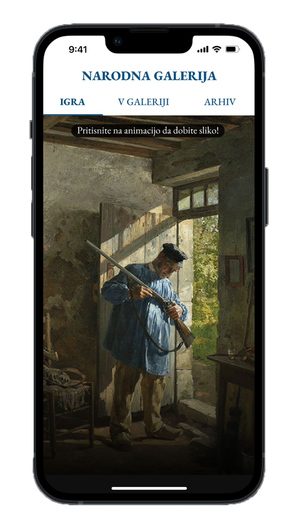
National gallery
The application provides an insight into the history of painting through selected Slovenian works exhibited in the National Gallery in Ljubljana (SI), which connects it to well-known works created in the same year.
In order to make it easier to review the history of art, paintings are usually classified by artistic periods and styles, but since these have often intertwined and coexisted in the world, in this application the paintings are linked by the year of creation and not by artistic style. Such an insight enables the perception of painting as a whole, where many intertwinings are observed in a given period of time and enables a deeper understanding of the relationship between the work of art, global events and the artistic spirit around the world.
Users can use the application at home and in the gallery. At home, they can access a set of images with a game that gives them a random year, they can also use an archive where all the works and their years are listed. In the gallery, they can also access a specific set of images by scanning the QR code next to the selected artwork.
The design of the application follows the overall graphic image of the gallery. The main colors chosen are white, black and blue, the only deviations occur in the names of painting styles and places of creation, the color emphasis of which always comes from a specific image in the background of the text. The EB Garamond font family is used for flowing text, and the Roboto family (also Condensed and Slab) is used for style names, years, and other accents.
Prototype of the app is available here.
Authors: Tina Dernovšek and Žiga Vavričuk.